Loud Sound. Louder Looks.
One song. A whole visual beat.
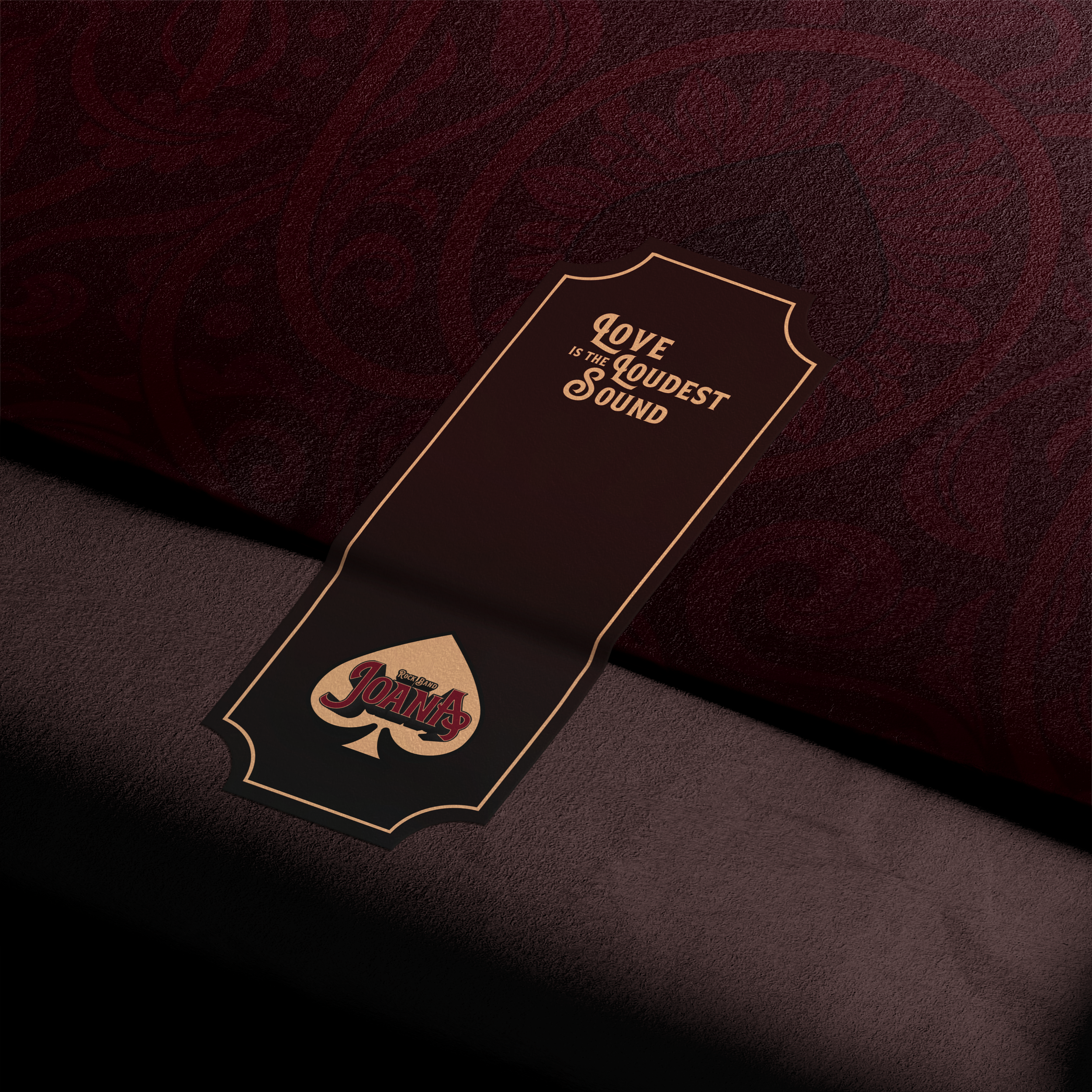
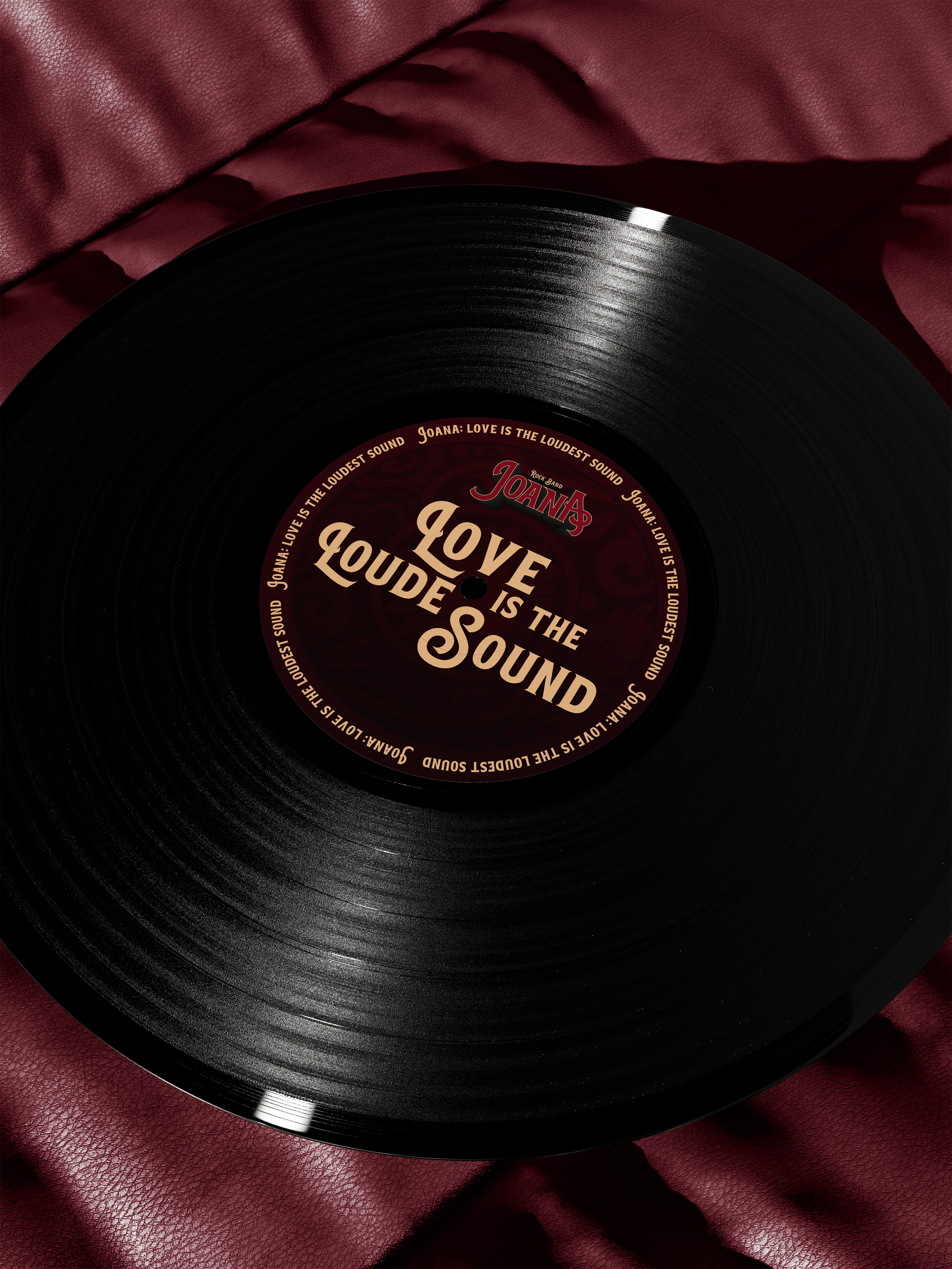
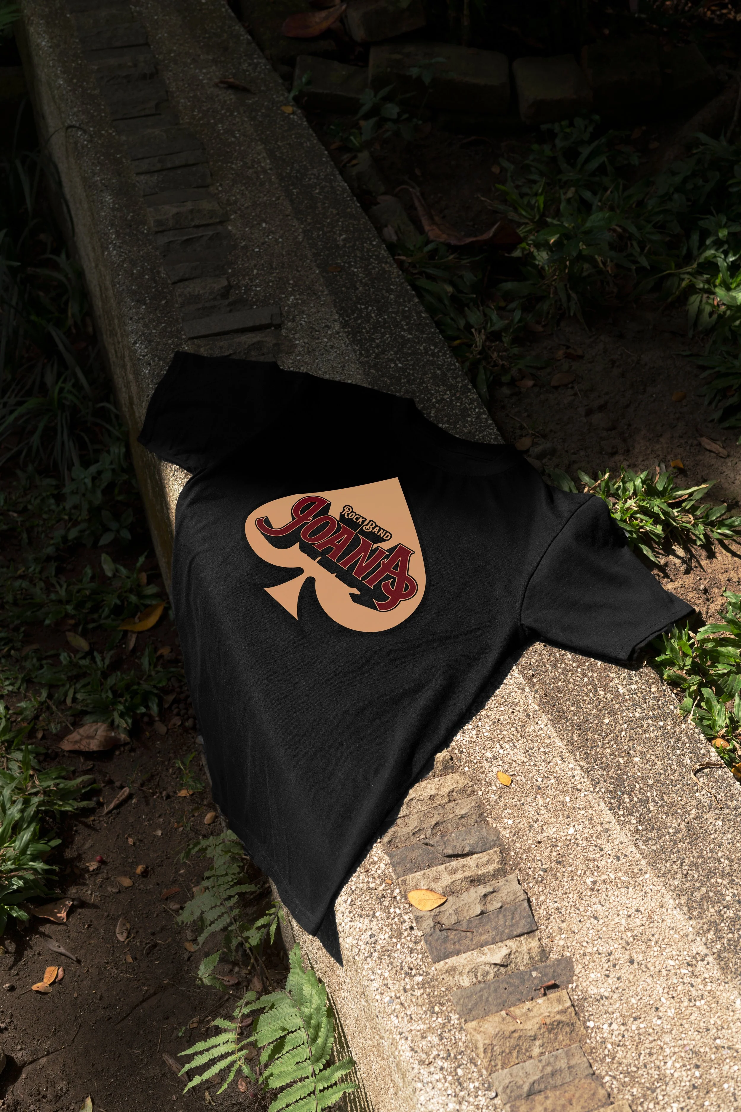
“Dama de Pică” (Queen of Spades), a standout track from Joana’s debut album, became the starting point for the band’s visual identity. I developed the spade into a central emblem, pairing expressive rock lettering with intricate ornament inspired by antique book covers and playing cards. Deep burgundy, warm gold and a restrained composition balance the richness of those references, giving Joana an identity with the presence of classic rock and the clarity to endure.